Clustering Geolocation Data of Taxi Ranks
- Ashreet Sangotra
- Aug 7, 2020
- 9 min read

Updated: Oct 4, 2020

We have taxi rank (taxi stand) locations for the city of Johannesburg, South Africa. We want to define key clusters of these taxi ranks, so we can build service stations for all taxis operating in that region.
Pre-requisites
To be able to understand to understand the code and perform the task, a basic knowledge of the following topics is assumed.
Basic Matplotlib skills for plotting 2-D data clearly.
Basic understanding of Pandas and how to use it for data manipulation.
The basic concepts behind clustering algorithms. We will be working with K-Means, DBSCAN and HDBSCAN.
Outline
We will divide the project into 7 parts.
Exploratory Data Analysis: Do some data cleaning and initial visualizations to get a sense of the data.
Visualizing Geographical Data: Plot the data onto a geospatial map. Will use the folium library for this.
Clustering Strength / Performance Metric: Work with dummy data to understand how clustering (K-Means) works. Will explore the influence of number of clusters on performance.
K-Means Clustering: Clustering data using K-Means and evaluating the clusters formed.
DBSCAN: Density-Based Spatial Clustering of Applications with Noise.
HDBSCAN: Hierarchal Density-Based Spatial Clustering of Applications with Noise.
Addressing Outliers: Address outliers from HDBSCAN (also called as singletons) and see how we can assign them.
That's it with the introduction. Let's get rolling!
Exploratory Data Analysis
Let's have a quick look at the data we will be dealing with. Here are the first 10 rows.

We are given the Longitude and Latitude for each Taxi Rank. 2 Taxi Ranks can have the same name but not the same Longitude and Latitude.
In total we have 838 rows .
The next step is to scan the data for missing values (NaNs) and duplicates, and get rid of them. The columns of interest here are 'LON' and 'LAT', as those 2 provide us with the unique taxi ranks. We will check for NaNs and duplicates along these 2 columns. A pair will be considered a duplicate if (LON, LAT) values of one item id exactly the same as the (LON, LAT) values of the second item in the pair.
After cleaning the data, this is what we get.

As seen from the above output, we have one row with missing values, and 14 rows that were duplicates.
We are working with a rather cleaned dataset, with limited features, both of them already scaled in proportion as they are map co-ordinates. So we don't need to further clean out data.
Let's visualise how these taxi ranks are spaced in a 2-D plane. We can do that by plotting a scatter plot between the 'LON' and 'LAT' columns of our dataset.
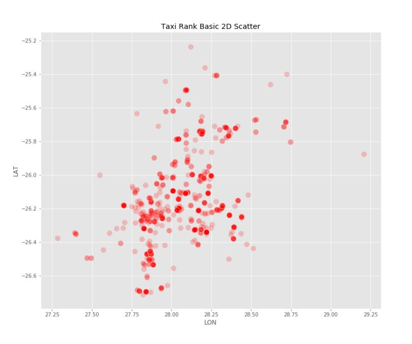
As we can, there are some areas that are denser than others. We would like our clustering model to take that into account while forming clusters.
Visualizing Geographical Data
Next, we will plot the above scatter plot on an actual map of Johannesburg. We will be using Python's folium library for the same. Folium lets to plot data on an interactive map interface. You can read more about it here.
I won't cover the actual code here (you can find that on my GitHub). Though I will talk about the general approach for plotting points onto a map using folium.
Initialise a map object with the map center at the mean values of (LAT, LON) columns.
Loop over each row of the dataset.
For each row, extract the LAT and LON values and add them to the map object.
That's it!

As you can see our taxi ranks are plotted on their exact location on the map.

On zooming in we see how the Taxi ranks are densely clustered around the City Centre. If we click on any Taxi Rank on the map, we can also see its name pop-out.
(To access the interactive map along with the code, the link is at the end of this blog)
Clustering Strength / Performance Metric
We will work with dummy data here to see how clustering strength changes with setting the right number of clusters.
We have initialised some random points clustered around random sample points.

In the above image the clustering is pretty neat and we can visually tell the different clusters apart.
We will use Silhouette Score as a metric to measure how well the clustering is. The silhouette value is a measure of how similar an object is to its own cluster (cohesion) compared to other clusters (separation). The silhouette ranges from −1 to +1, where a high value indicates that the object is well matched to its own cluster and poorly matched to neighbouring clusters.
Let's see how clusters are formed when we set number of clusters as 3 vs when set at 10.

Both the plots do a decent job at splitting the data into the needed clusters. However when clusters are set to 10, we get the best Silhouette Score.
Even though Silhouette Scores give a general idea on how well the clustering is, it should be taken with a grain of salt. We don't mind settling for a lower Silhouette Score if the clustering serves our use case well. Do keep this in mind. We will revisit this idea towards the end of the blog!
K-Means Clustering
The first clustering model we will test is the most well known and used commonly for clustering tasks. It has its own set of Pros and Cons.
Pros include the fact that it's simple to understand and implement. It also scales to larger data sets quite well. And it guarantees convergence. However it's not always global convergence. Let's implement the model on our Taxi Ranks data and see what outcomes it generates.
We will initialise the number of desired clusters at 70. This is random starting state - however an estimated guess based on the problem at hand.
Next we will fit the model to our (LON, LAT) data, and then predict cluster numbers for each data point (taxi rank). Let's add the predicted clusters as a column to our original dataframe and look at the top 10 rows.

We will now plot these taxi ranks back on the map, colour code them based on their cluster numbers and add the cluster number as a pop-up when we click on a taxi rank.
Note: We don't have 70 distinct colours for each of our clusters. So some clusters will have the same colour. However when we hover over the map and click on the taxi ranks, the distinct cluster number will show.
K = 70 | Silhouette Score = 0.6367

The above map shows 70 different clusters and a resulting Silhouette Score of 0.6367
Let's try different combinations for number of clusters to find where we get the most optimum Silhouette Score.
It's important to note before, that we can keep increasing the number of clusters until we have one for each taxi rank. That will give us the best score, but completely defeat the purpose of Clustering. For our purpose we will observe Silhouette scores from 2 clusters to all the way upto 120.

Optimal clusters based on silhouette score are 108. However it's feasibility given our problem is a challenge. It might turn out to be an expensive affair to set up so many service stations.
We will park our clustering performance with K-Means here for now. We will bring it back towards the end, when we compare it with other models, to decide the best one.
We spoke about the Pros of K-Means earlier. On the other side of its downfalls, K-Means doesn't cluster well if cluster shapes are not spherical in nature. It needs the user to define the number of clusters (K). Also, it doesn't take into account the density distribution of data and assumes uniform density.
Our next clustering model will try to address these challenges!
DBSCAN
DBSCAN stands for Density-Based Spatial Clustering of Applications with Noise. As the name suggests DBSCAN Clusters based on density of points. In our case clusters will be formed only if there is a minimum set of taxi ranks in a given radius. I won't dive into the details of the algorithm. You can find out more here.
DBSCAN doesn't need predefined number of clusters, and it generalises well even if the clusters are not of spherical shape. The last point doesn't necessarily have much use given our problem at hand, but it's quite helpful in harder clustering problems.
One important aspect of DBSCAN is the idea of noise, which essentially tells that taxi ranks that are far sparse or isolated in comparison to our DBSCAN density hyper-parameters are left un-clustered. They are assigned a cluster value of '-1' to keep them distinct from taxi ranks with assigned cluster numbers. These sparse or isolated taxi ranks are considered as noise to the overall dataset.
That's a bit of theory! Now let's get to building and running the model! As done previously, we will train our (LON, LAT) values using DBSCAN model and predict clusters for the data. Then we add another row to the original dataframe to see the clusters assigned.

As we can see clusters are assigned to each row with '-1' being used to represent the noise points (also called as Outliers). Let's check how our revised map looks like. All Outliers are represented by black circle markers.

You can tell the number of Outliers are quite a lot. Let's see a quick summary for our model to find out more on that.

The number of outliers (un-clustered data) are extremely high at 289 taxi ranks. If we ignore these outliers or noise, the Silhouette score is 0.9232.
When we consider these outliers as singletons, the silhouette score drops. Initially all outliers were represented by '-1'. As Singletons, each outlier is assigned an independent cluster number, that is distinct and not already being used to represent any existing cluster.
One reason why we are left we so much noise if because our cluster density is kept the same throughout the map. It's fair to say and can also we verified by the map, that the the taxi ranks are denser in city center as compared to the outskirts of the city. So using the same density estimate won't generalise well over the entire city.
This is where Hierarchical - DBSCAN comes in. Here, the density is not kept uniform and changes over the dataset. We will explore that up next.
HDBSCAN
H-DBSCAN stands for Hierarchical - DBSCAN. The key difference as can be found from a simple google search is:
While DBSCAN needs a minimum cluster size and a distance threshold epsilon (cluster radius) as user-defined input parameters, H-DBSCAN is basically a DBSCAN implementation for varying epsilon values and therefore only needs the minimum cluster size as single input parameter.
Let's see how well H-DBSCAN performs for our problem.

The noise seems to be less, let's verify that by plotting the map and then looking at a quick model summary.

Comparing with our precious map, the Outliers (denoted by the black circle markers) are significantly lesser.

Comparing DBSCAN and H-DBSCAN, our clusters have increased from 51 to 66. More importantly our Outliers (noise) has gone down from 289 all the way to 102.
Our Silhouette score including the Singletons is 0.638 compared to 0.566 of DBSCAN.
Even though our Silhouette score ignoring outliers has reduced with H-DBSCAN, we don't consider that here, since for our problem at hand, we want as many taxi ranks to be assigned to a cluster as possible. Thus we prefer a model with less Outliers.
Addressing Outliers
As already established, given our use case we prefer a model with least Outliers. We cant have one service Centre for each Singleton. That would be too expensive!
Our goal here is to have 0 Singletons. We will address these Outliers by using something called as an Hybrid Model. The key idea is to assign all singletons to their neighbouring clusters. This approach only makes sense given the problem at hand. It would make sense for the Taxi service Centre of the closest cluster to be assigned to the Singleton taxi rank.
To do this we will use supervised learning techniques! Hence the name 'Hybrid Model'
We will train a supervised learning model on all the non-singleton clusters - with Lat and Lon as features and cluster number at target variable
We will then let the trained supervised model predict cluster numbers for the singletons.
The model we will be using is K-Nearest Neighbours (KNN) Classifier. Once again you can find the code-work in my GitHub (link at the end of the blog). However I will summarise the steps below.
Divide the data into train and test sets. Train set is all (Lon, Lat) points where the column 'CLUSTER_HDBSCAN' is not equal to -1. Similarly test set is all rows where 'CLUSTER_HDBSCAN' is equal to -1.
Divide the train and test set further in features and target variables. The test set doesn't have existing target variables as that is what we are supposed to predict.
Train the KNN Classifier on train set and then predict target variables for test set.
Let's add these predictions to out dataframe.

As we can see, there are no Singletons ( '-1' values). Lets see the updated map.

This looks like a much better cluster formation, with all the distant points being added to their nearest clusters from H-DBSCAN.
The Silhouette Score for the Hybrid model is 0.568, which is less that H-DBSCAN. But it's something we don't mind for our problem at hand.
Conclusion
Since our Hybrid Model is built upon the short-comings of DBSCAN and H-DBSCAN, it definitely performs better than those 2 for our problem. However lets see how our Hybrid Model clusters in comparison with our initial K-Means Clustering technique. We won't be comparing the Silhouette scores for obvious reasons now. Instead we will have a look at the histogram plots of Cluster Size for both models.
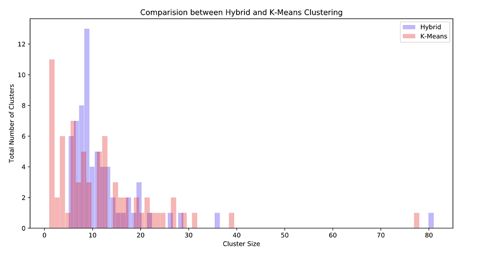
Note: That one Cluster with cluster size above 75 for both models, represents the highly dense city centre!
With K-Means there are lots of clusters of size less than 5. This is not feasible economically, as it will be expensive to operate service stations for very few taxi ranks.
On the other hand, Hybrid Clustering forms clusters with at least 5 taxi ranks, and assigns the singletons to the nearest cluster instead of making them independent clusters.
From these insights we can conclude that the Hybrid Model performs better for our use case!
Further Readings
1. Find my GitHub Repo for this project here.
2. For code and interactive folium maps, refer the nbviewer Jupyter file here.
For some additional reading, feel free to check out K-Means, DBSCAN, and HDBSCAN clustering respectively.
It may be of use to also check out other forms of clustering that are commonly used and available in the scikit-learn library. HDBSCAN documentation also includes a good methodology for choosing your clustering algorithm based on your dataset and other limiting factors.
References:
1. Blog Cover Photo: Photo by Jake Heinemann from Pexels
2. Original Project: https://www.coursera.org/projects/clustering-geolocation-data-intelligently-python
3. https://towardsdatascience.com/understanding-hdbscan-and-density-based-clustering-121dbee1320e


Comments